

Making savings feel REAL on Amazon Now
CLIENT
Amazon Now
ROLE
Senior Product Designer
TEAM
Product Lead: Mitesh Kumar
Design Lead: Aayush Sinha
Design: Rhiddhit Paul, Muskan Gupta, Antara Kartik
YEAR
2025 - 2026
BACKGROUND
In March 2025, Amazon Now launched in Bengaluru with an ambitious proposition –
better prices than the competition, and zero extra fees.
By the time Amazon entered quick commerce in 2025, Zepto, Instamart, Blinkit, and Flipkart Minutes were already household names. They had the supply chains, the inventory, and the trust. As speed and assortment reached parity, price-value became the battleground. Amazon Now had the numbers. Customers just didn't believe it.


8 in 10 customers interviewed post-launch believed competitors had better prices and offers — even when the data said otherwise.
"We should improve the hero banner.
People will understand savings then. "
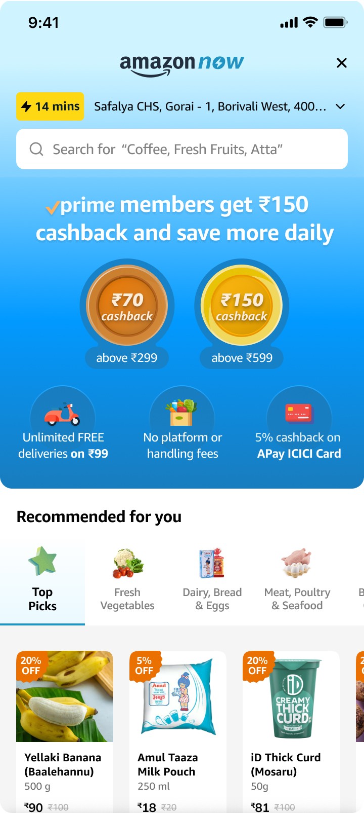
Leadership thought the banner wasn't clear enough, and wanted to focus on redesigning the messaging. The banner template had been designed to convey 3 ideas - no surge fee, no handling fee, and free delivery above ₹99. But, as more propositions were added, the banner was not able to communicate them clearly. While Aayush and I felt that a savings perception problem was not going to be solved just by updating a banner design, we decided to test it out anyway and get concrete feedback from another user session.

Original Hero Banner
High cognitive load
Not unique to Now
Contrast and accessibility issues
Too many ideas for one banner?
Main cashback communication in one card
🚩
We quickly designed new banners, and tested them with a few customers, but customers still felt competitors had better value for money. The previous banner had worked better.



New Hero Banner Options
What competitors did different
Competitors built up savings perception throughout the journey. From discovery, to cart-building, and checking out, strategies were layered carefully to make their value for money unmissable.


Insights from Customers
Hunting for answers, we interviewed 12 customers as they ordered groceries – comparing the experience on Amazon Now to competitor apps. A number of gaps surfaced.


FADED PROMISE
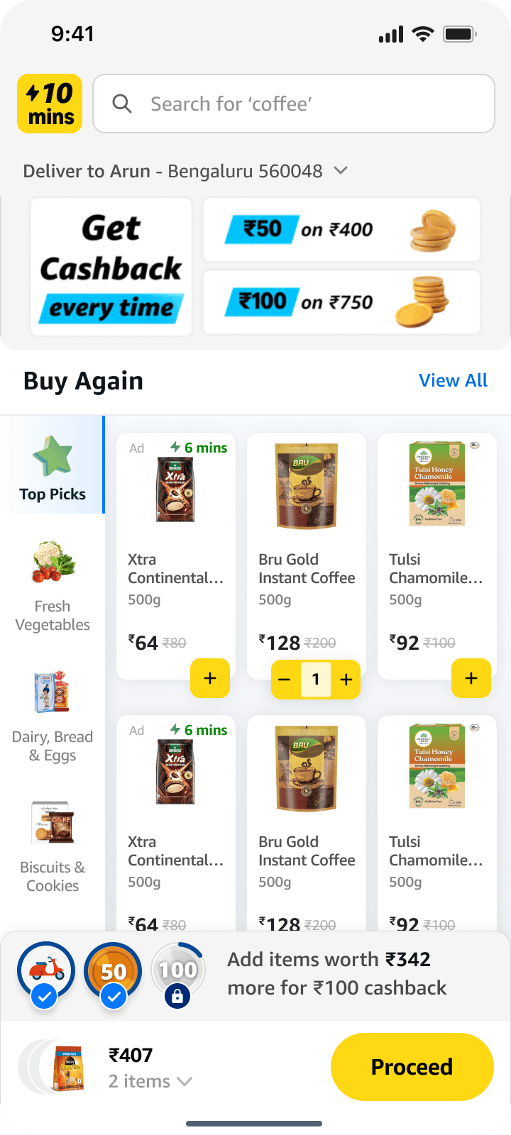
Cashback offer only communicated on homepage
"This is the first time I am reading what is on the banner. Normally I directly go to search."

MISSING INFORMATION
Product cards lacked the signals customers used to judge value
"I compare price between brands using price per kilogram. But that is not even there on the card.

HIERARCHY ISSUES
Users missed discount information on cards
"I didn't even notice the discount badge at first. It would be better if it was closer to the price"

SILENT CHECKOUT
Cashbacks and savings not communicated on checkout
"I only realized I was getting cashback when I received an sms telling me cashback had been credited to my account"
The strategy
Savings needed to be communicated contextually – aligned with customer intent at different parts of the shopping journey.


1 | Building Awareness on Amazon.in
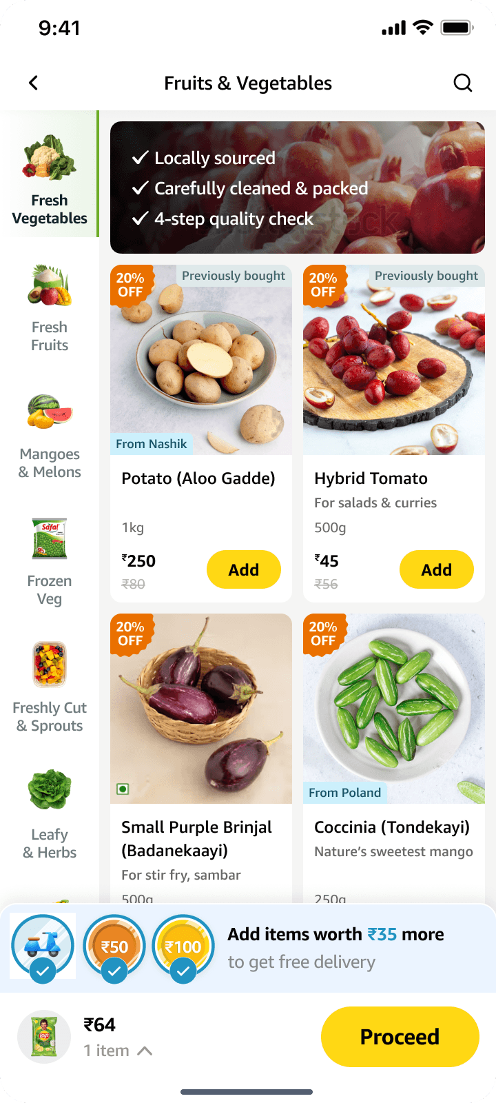
Using Prices of Fruits and Vegetable to increase CTR on DiScovery Banner *
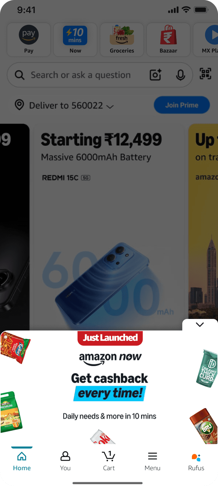
The original entry point led with a generic cashback banner. The redesign replaced it with a bottom sheet anchored in "Looowest Prices guaranteed," backed immediately by real prices on everyday staples — the items Indian shoppers already have a number in their head for.
For customers, real prices were the biggest test of value

Before
After
2 | Emphasizing price value on the
Amazon Now storefront
Surfacing deals
While Amazon Now had incredible prices which were lower than competitors, there was no dedicated section on the storefront to highlight these deals. We proposed a new section for deals discovery that would sit just under the 'Offers banner'. This could also be thematically designed for festivals and events.
There were no sections to highlight the incredible deals on the existing storefront
Renaming sections to highlight price *
Another change which could be very quickly implemented but made a big impact was to rethink how each section was named. After a meeting with the marketing team, who controlled storefront section naming, we suggested a naming convention which highlighted the low cost of Amazon Now product categories.

Storefront ATF (Before)

Storefront ATF (After)
3 | Drawing attention to
deals in Search
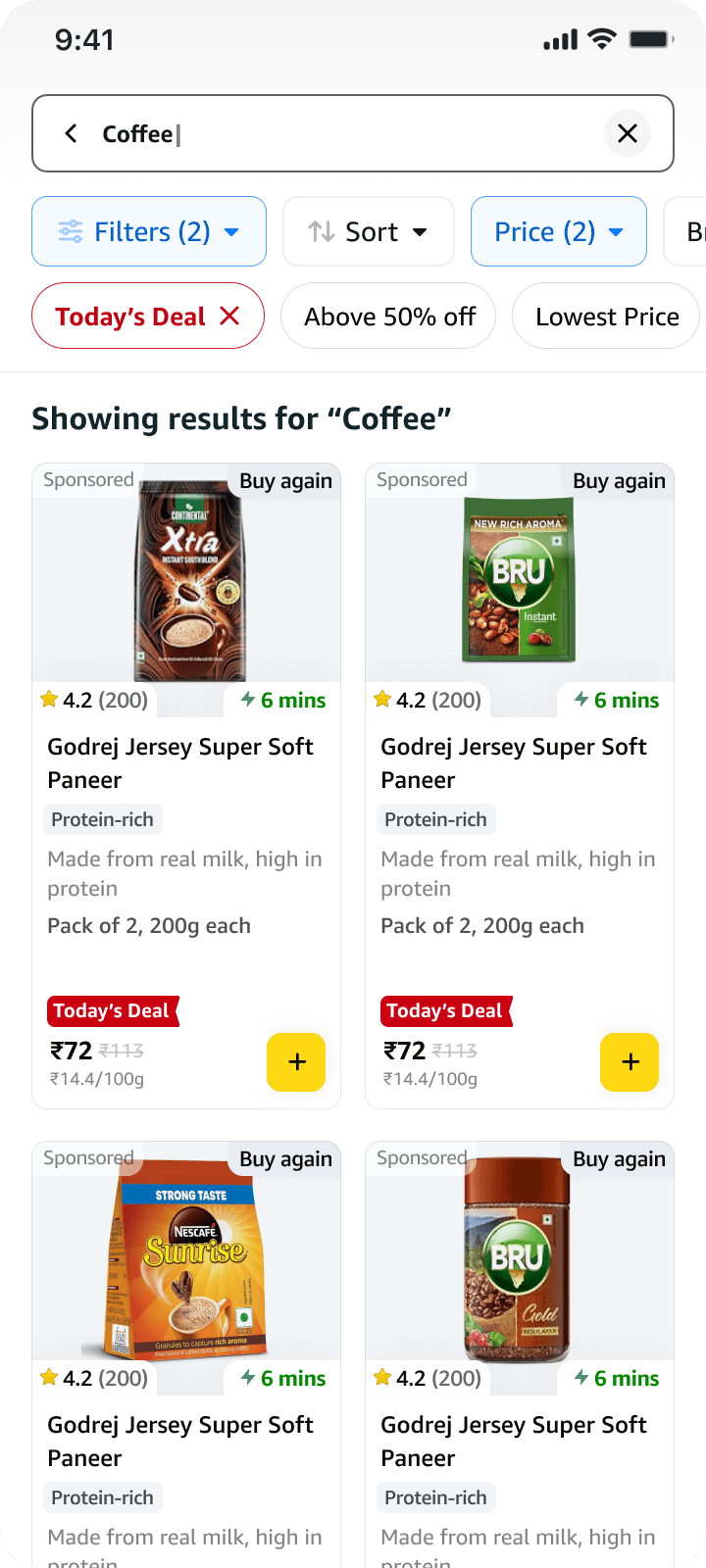
Filter by Deals
Deal signals surface in the search dropdown and as quick filters - making value-hunting a one-tap behaviour.

Search Results with Deal filters
4 | Savings as the core
attraction in product cards
The Product Card Overhaul
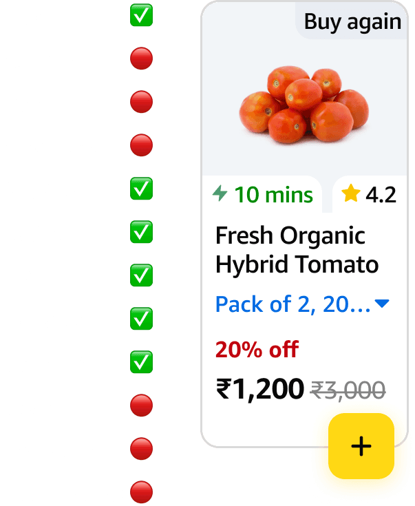
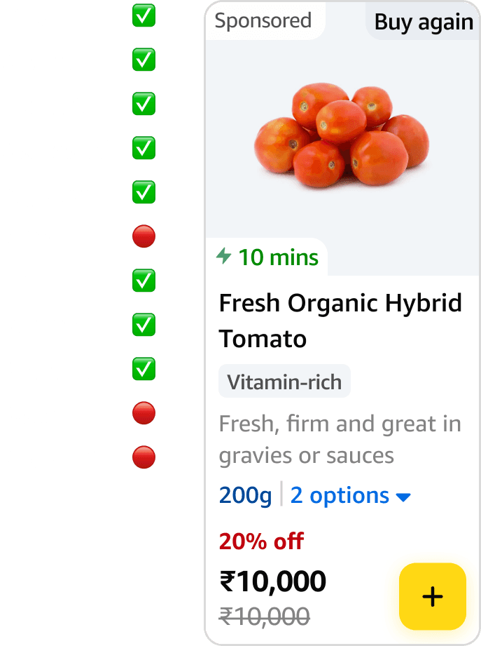
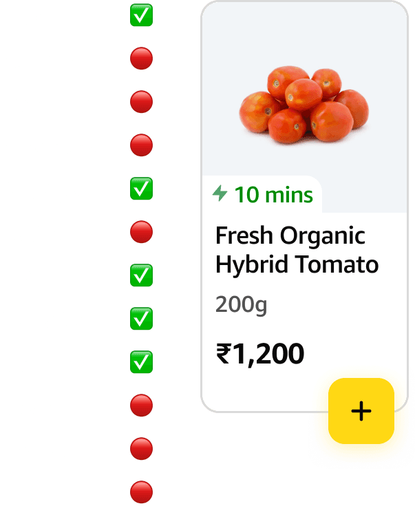
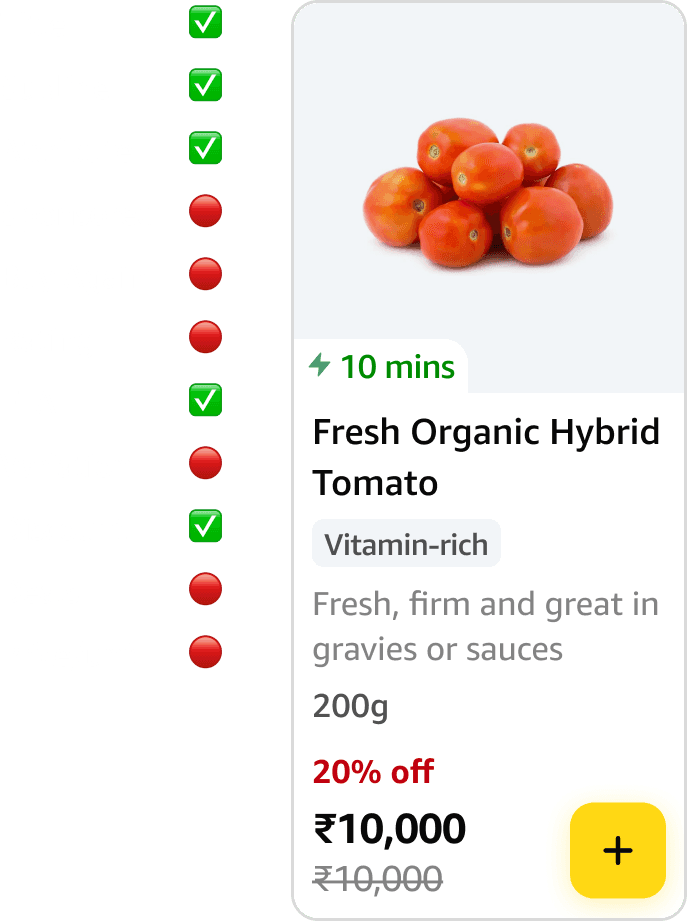
Product cards were redesigned to make savings immediately scannable — adding deal badges, strikethrough pricing, per-unit cost, and delivery time. The deal is now the first thing you read, not something you have to look for.
THE STARTING POINT
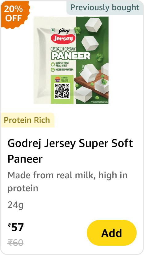
The first version of the product card that went live, got the job done, but it had it's fair share of problems and room for improvement. However, it was dearly loved by leadership, and quite a few customers said it felt 'clean'. Leadership did not really want to play around with it.
Deals on top of Discounts
The business team wanted to introduce two new discount types — 'Crazy Low Prices' and 'Prime Prices' — stacked on top of existing discounts. The constraint: keep the current card layout intact. The only available real estate was the price block at the bottom.
Ratings, Time to Delivery, and the turning point
Special deals were deprioritised after a few weeks, shifting focus to ratings and delivery time on the product card. But the exercise opened up the layout — and that flexibility became the foundation for what came next.
Scannable savings on the product card
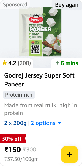
Product cards were redesigned to link savings and product price close together to reduce chances of being overlooked. We also carved out space for deal badges, strikethrough pricing, per-unit cost, and delivery time. By grouping deals with product, users did not have to actively look for it anymore.
Easy to miss

Product Card (Before)
Product Card (After)
Scannable, scalable







5 | The cartbar as an element of cashback recall
The cartbar was the only omnipresent state trhoughout the journey
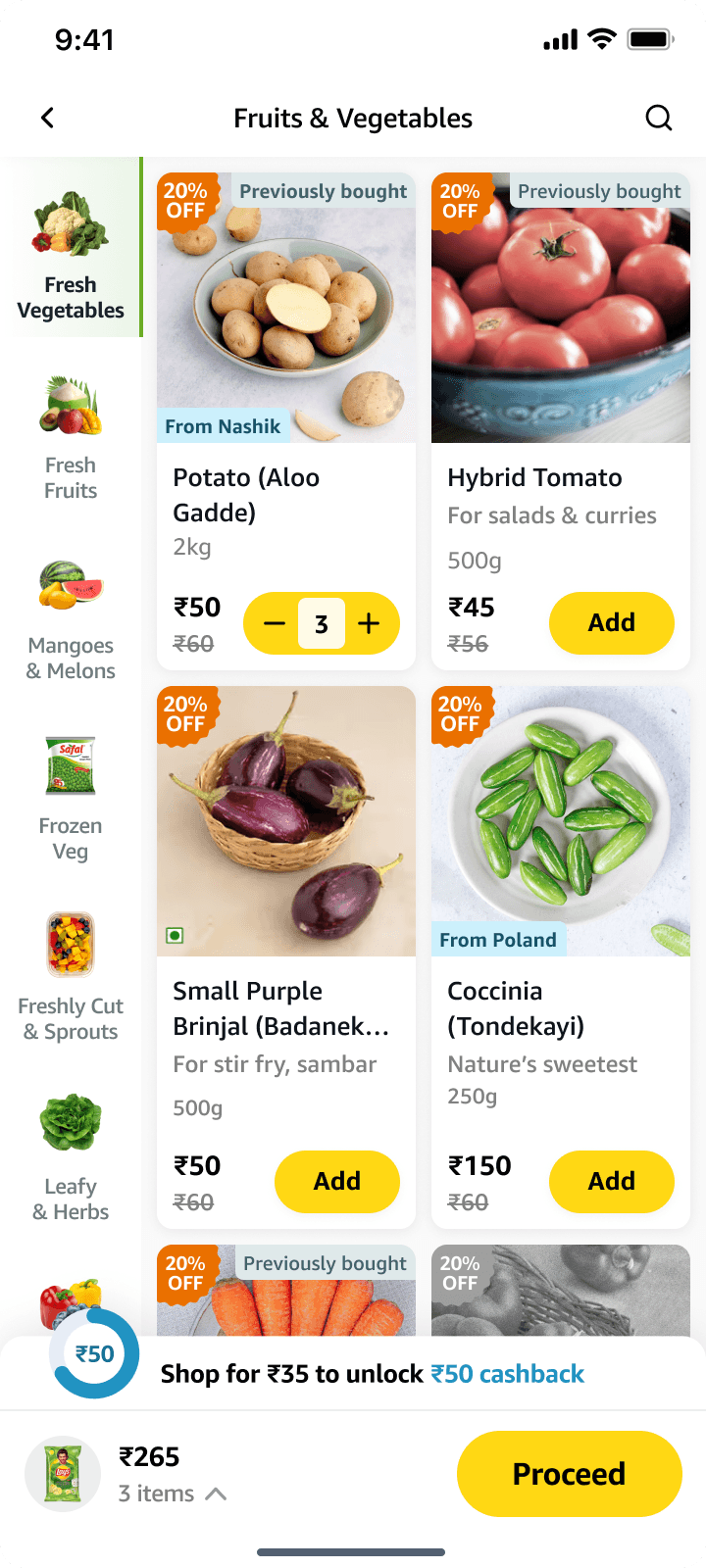
One of the biggest positive impacts to the customer experience was improving the cart progress meter or cartbar, which showed how much the customer had to add to the cart to
Initial design ineffective for multi-tier cashbacks
The existing 'Cart Bar' did not highlight multi-tier cashbacks
The initial design for the cart bar was largely based on what competitors had done already. The issue was, competitors only had to design for just the Free Delivery milestone, but we had multiple tiers of cashbacks.
The challenge was designing with limited real estate
We started our explorations by trying to indicate that further milestones were available, but soon realized that knowing exactly what those milestones were was also very important.
Helping customers discover each and every milestone
The challenge was to fit a lot of information in a small space without overwhelming the user.
We also had to decide whether the user had to take an extra action to view this information or not.
Refining the layout to reduce cognitive load
We decided to go with the second direction - keep milestones upfront. Grouping the milestones together on the left considerably reduced the cognitive load.
But in testing, the design left users disappointed
We were pretty confident that the new design would work, and that users would be comfortable using it - but we were in for a shock. Customers felt that they were being more cashback than they were actually getting at the end of their orders.
Using motion to remove confusion
After some thought, some sketching and a number of bad ideas, I decided to try to solve the issue with some simple motion design. This would be a challenge on the tech team as motion guidelines had not been set up yet, but this was one constraint we had to push through.
There was a significant tech contraint as motion guidelines had not been set up yet
After further testing among Amazon employees, and positive results, this was the first version of the new cart bar that went live to all customers!
…and later we made it easier to remember the milestones
We realized that the business team wanted to try out different cashback levels for different user cohorts. Different marketplaces around the world also would have different offer sturctures. Amazon Fresh - which was also using our design system and components by now, had different cart milestones and offers. An effective solution was to add offer details on tapping the cart bar. This made it so that customers could view the detailed breakdown of cart milestones anywhere in the shopping journey.
Helping users achieve their milestones
A few months after the cart bar launched, leadership wanted to increase the average units per order on Amazon Now.
While customers now understood the cart milestones, figuring out what to add to reach them was still difficult. At the time, recommendations were primarily shown near checkout, but I believed it would be more effective to surface them directly from the cart bar itself.
I proposed a recommendations drawer that users could access throughout their shopping journey, making it easier to discover relevant add-ons at any time.
Once implemeted, the recommendations drawer helped increase Average Units Per Order by 2.6% in just one week.
While the first phase was to use the recommendation component that was already available from the storefront, phase 2 explored incorporating a curation of items that helped the customer get to the next milestone with one tap, while also being highly contextual to the time of day, customer's shopping intent and preferences.
Cart Progress Indicator (before)
Cart Progress Indicator (After)
6 | Reiterating savings at checkout
Being bold and testing the waters
On the checkout page, savings information was initially subtly placed at the very top. However, It was easily missed, as users would directly look at the bottom of the screen to check the final price.
Seeing the price of items add up cleanly to the final price was the first layer of delight, but that was where it stopped.
We felt that the experience needed a cherry on the top, and so we created a savings summary at the very top. This was a bold move as it went against patterns users were familiar with, and could take time to feel intuitive, but it was a tradeoff we were willing to make.

Checkout ATF (Before)
Checkout ATF (After)
When users scrolled down to view their bill summary, we further emphasized how much they had saved through discounts and cashbacks.

Checkout BTF (Before)

Checkout BTF (After)
RESULTS
A few months after implementing these changes,
people thought Amazon Now had gone crazy



The impact:
The interventions had a confirmed positive impact on Average Order Value. Most notably, the cashback communication shifted a significant percentage of orders that previously sat below ₹349 into the ₹349–₹749 bracket which was a meaningful behaviour change that directly reflected the milestone nudge strategy.
What I would still like to know:
Exact numbers aside, there are three questions I'd want answered to gain insights into how people were using the design
What percentage of users tapped to open cart recommendations when they were within ₹X of a milestone?
Of those, how many actually added an item?
By how much did it shift average units per order?
That distinction, whether it was the milestone proximity cue or the recommendation itself driving action, would shape how the next iteration gets designed.
The part no dashboard captured
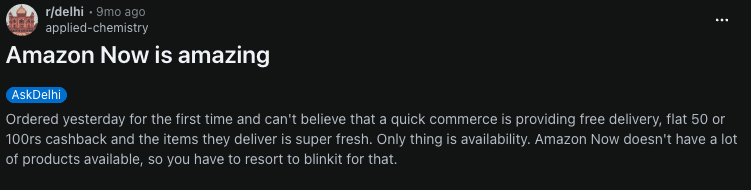
Across the world, people started screenshotting their savings and sharing them. In Bengaluru, I kept getting asked if I'd tried Amazon Now yet, because it was offering the best value for money. Every paper Amazon Now bag I spotted on the street made me feel something a dashboard couldn't measure: that people were genuinely benefitting from something I'd worked closely on.
I felt proud that customers kept complimenting the transparency of Amazon Now with its communication of cashbacks, offers and deals. While other apps took a louder approach, our subdued, yet honest, approach was something that customers resonated with.
Immitation is the greatest flattery
Amazon Now was the first in the Indian quick commerce market to combine no handling fee, no surge charge, and free delivery at a low cart value — all in one proposition. We were also the first to explicitly surface savings to the user and introduce multi-tiered cashbacks tied to cart value, while competitors were still limited to free delivery thresholds.
It took a lot of iterations, wrong turns, and hard-won back-and-forth before we got it right. We soon noticed Instamart, Zepto, and Blinkit quietly introducing their own multi-tier offers and savings summaries at checkout. I'm glad that something I helped bring to Amazon customers eventually ended up benefitting quick commerce customers everywhere.