

x

Helping customers save upto 14% more on Amazon Now
CLIENT
Amazon Now (via HumanX)
ROLE
Senior Product Designer
TEAM
Product Lead: Mitesh Kumar
Design Lead: Aayush Sinha
Design: Rhiddhit Paul, Muskan Gupta, Antara Kartik
YEAR
2025 - 2026
THE BACKGROUND
In March 2025, Amazon launched Now in Bengaluru, promising delivery in 10 minutes with maximum savings
THE POTENTIAL
With cashbacks, customers could save 14% more than competitors like Zepto and Blinkit
THE PROBLEM
Despite this, 8 of 10 customers believed competitors had better value for money


Help customers make the most of
Amazon Now's offers, cashbacks and savings potential
THE GOAL
THE OBVIOUS FIX
Our first, most obvious fix was to redesign the savings banner communication to improve understanding of the offer

Original Hero Banner
High cognitive load
Not unique to Now
Contrast and accessibility issues
Too many ideas for one banner?
Main cashback communication in one card


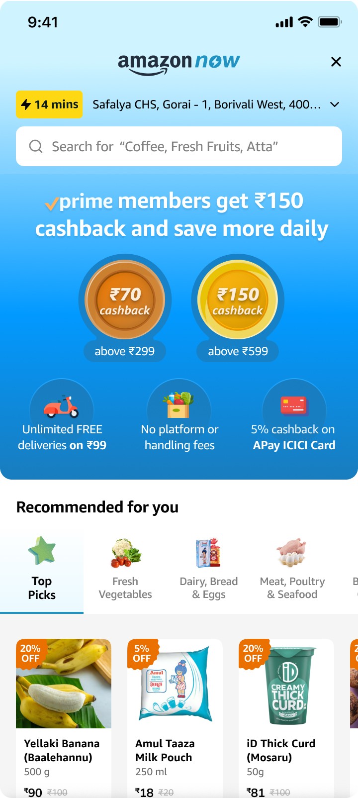

New Hero Banner Options
Unfortunately, it had very little impact.
Informing the customers through a banner was not enough.
But, what if we made it unmissable?


This felt intrusive and could frustrate
customers who wanted to just shop.
We needed to dig deeper.
What competitors did different
Competitors built up a savings perception that tied together
throughout the journey using a combination of strategies.


Insights from Customers
To build a deeper understanding, we interviewed 12 customers
while they were ordering groceries on Amazon Now.

INSIGHTS AND GUIDELINES
Cashback and savings had to be integrated into shopping journey.
Keeping this in mind, we created five guidelines for design interventions:
1
Information from anywhere
2
No thinking needed
3
Visible victories
4
Guide to the best value
5
Aid in cart building
How might we help customers notice savings on product cards
Savings on first glance
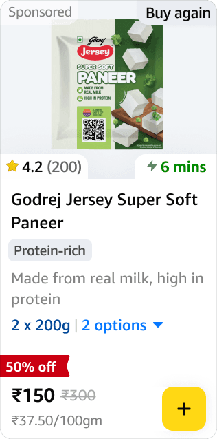
Product cards were redesigned to make savings immediately scannable — adding deal badges, strikethrough pricing, per-unit cost, and delivery time. The deal became the first thing the user noticed.
No thinking needed
Aid in cart building
Visible victories
Easy to miss

Product Card (Before)
Product Card (After)
Scannable, scalable
Best Value on Variants
Some products had variants in sizes or colours. When such a product was added to cart, customers would now be able to see whether there was a variant at a better value available.
Guide to the best value
Aid in cart building
Search Results with Deal filters
Business impact
Reduced time to first ATC
How might we help customers discover the best deals?
Deals on homescreen
We proposed a new section for deals discovery that would sit just under the 'Offers banner'. This could also be thematically designed for festivals and events.
No thinking needed
Guide to the best value

Storefront ATF (Before)

Storefront ATF (After)
Filter by deals
We worked with the backend team to allow users to filter by deals in search.
Guide the user to the best value
Aid in cart-building

Search Results with Deal filters
Business impact
Improved ATC rate, reduced browse-abandonment rate
How might we help customers achieve cashback milestones?
DESIGNING A CART MILESTONE INDICATOR
We designed a cart milestone meter that helped users know how much more they had to their cart to reach their next cashback. This improved Average Order Value of Amazon Now customers, while helping them save more.
Information from anywhere
Aid in cart-building
No thinking needed

Cart Progress Indicator (before)
Cart Progress Indicator (After)
Offer Details from Cart Milestone
By tapping anywhere on the cart milestone barm users would be able to see details for each milestone from anywhere in the journey
Information from anywhere
No thinking needed
Details from Cart Milestone Bar

MILESTONE Celebrations
We added celebratory animations to the cart milestone indicator so that customers felt a hint of delight every time they unlocked a cart milestone
Visible victories
No thinking needed
Milestone Celebrations
CART Recommendations
One of the biggest positive impacts to the customer experience was improving the cart progress meter or cartbar, which showed how much the customer had to add to the cart to
Guide to the best value
No thinking needed
Add from the Cart Bar
Business impact
Average order value increase, improved units per order by 4%
How might we reaffirm price value at the end of the journey?
SAVINGS ABOVE THE
FOLD ON CHECKOUT
We redesigned the checkout page to highlight the overall savings at the top of the page, so that customers could get a clear understanding of exactly how much they were saving.
Visible victories
No thinking needed

Checkout ATF (Before)
Checkout ATF (After)
SAVINGS HIGHLIGHT
ON BILL SUMMARY
A breakdown of the cashback was highlighted in the bill summary making it even more prominent. It would help customers compare the total amount spend with the total amount saved.
Visible victories

Checkout BTF (Before)

Checkout BTF (After)
CASHBACK RECEIVED WIDGET
After the order was placed, the customer was informed on the post order screen exactly when the cashback amount had been credited to their Amazon Pay Balance, for them to use across the Amazon store.
Visible victories
No thinking needed

cashback communicated post order
Business impact
Improved checkout completion rate,
increased repeat purchase rate
THE FINISH LINE
We wanted to help people save more.
We ended up building trust.
We created transparency.
Across the world, people started screenshotting their savings and sharing them. In Bengaluru, I kept getting asked if I'd tried Amazon Now yet, because it was offering not only the best value for money, but it was transparent, and trustworthy. You ended up paying only for what you added to your cart, and Amazon Now helped you get more cashback on top of that. Every paper Amazon Now bag I spotted on the street made me feel something a dashboard couldn't measure: that people were genuinely benefitting from something I'd worked closely on. While other apps took a louder approach, our subtle, yet honest, approach was something that customers resonated with.
We were copied by everyone.
Amazon Now was the first in the Indian quick commerce market to combine no handling fee, no surge charge, and free delivery at a low cart value — all in one proposition. We were also the first to explicitly surface savings to the user and introduce multi-tiered cashbacks tied to cart value, while competitors were still limited to free delivery thresholds.
It took a lot of iterations, wrong turns, and hard-won back-and-forth before we got it right. We soon noticed Instamart, Zepto, and Blinkit quietly introducing their own multi-tier offers and savings summaries at checkout. I'm glad that something I helped bring to Amazon customers eventually ended up benefitting quick commerce customers everywhere.