

x

Building an Accessible Design System for Amazon Now
CLIENT
Amazon Now
ROLE
Senior Product Designer
TEAM
Dev Lead: Rachit Singh
Design Lead: Aayush Sinha
Design: Rhiddhit Paul
YEAR
2024 → 2026
BACKGROUND
Amazon Now launched fast and validated quickly. But we soon realized that the speed had left a big gap - accessibility and consistency.
When I joined Amazon Now in October 2024, the focus was speed. Components were built as needed. Consistency and accessibility were problems for later.
But as we scaled to new cities and markets, the gap became impossible to ignore.
My lead and I built NIMITH Design System to fix that: a shared foundation where accessibility was at the core of every decision.
Impact OF NIMITH at a glance
50% less
production effort
Reusable components to reduced development and design time, while maintaining quality.
Adopted by
2 sub-brands
After Amazon Now, the system was also adopted by Amazon Fresh.
Scaled to 10+ countries
In less than a year, Now scaled to UK, Japan, Brazil, Mexico, The Middle East, India and more.
PHASE 1
The Post-Launch Audit
THE SIGNAL FROM CUSTOMERS
Soon after launch, the initial signal for an audit came from our early customers
A piece of feedback that we continuously heard after launch was that the product did feel 'clean' compared to competitors, but in many places it was hard to read and interact with.
Product names on cards were too small, and misclicks were also common, due to small tap areas.
As we went deeper, we noticed that many of the components had low contrast, small type, and no clear visual hierarchy. It was time to focus on the details of the experience.


Contrast too low on cards
Text size too small - 11px
Text size too small - 9px
Contrast too low
Contrast too low
THE AUDIT PROCESS
We checked each section for WCAG 2.2 compliance
Along with accessibility, we also made a note of colour and type inconsistencies as well as icons and illustrations used.

PHASE 2
Audit Findings
COLOUR AUDIT FINDINGS
The launched designs had a limited colour palette and redundant hexcodes
The neutral and blue palettes were the most disorganized despite being the most important palettes for the brand.
There were no guidelines on how to use combine different colours together to ensure accessible contrasts.

TYPOGRAPHY AUDIT FINDINGS
Letter spacing, line heights and size were inconsistent. A readable base size was missing.
While there were only a few text sizes used throughout the product, a number of instances with slightly different letter spacing or text height led to a lack of coherence across the flows. In many areas, the main body type used was 12px which was far less than the recommended accessibility size of 16px.

PHASE 3
Accessible Foundations
Non-Negotiables
The hardest constraint to get right was making colour and type work together across every context without sacrificing accessibility. We anchored the system to WCAG AA as a baseline, then made one deliberate call on minimum body text size — a single decision that would hold across the entire product.
Colours
The design system uses a 9-scale color palette, each scale spanning 16 steps from 10 to 1000. This granular range allows for fine control over tonal expression across every layer of the UI — from subtle tints to deep, saturated shades.
The fine-grained lower end (10, 25, 50) enabled precise control over near-white surface variations, while the steps at 800 to 950 provide intermediate dark tones useful for depth layering in dark-mode contexts. Each step is calibrated so that white text passes AAA contrast requirements on steps 600 and above, and dark text passes AAA contrast on steps 300 and below, keeping the palette accessible out of the box. Between 400 to 600 the text passed AA accessibility.


Type
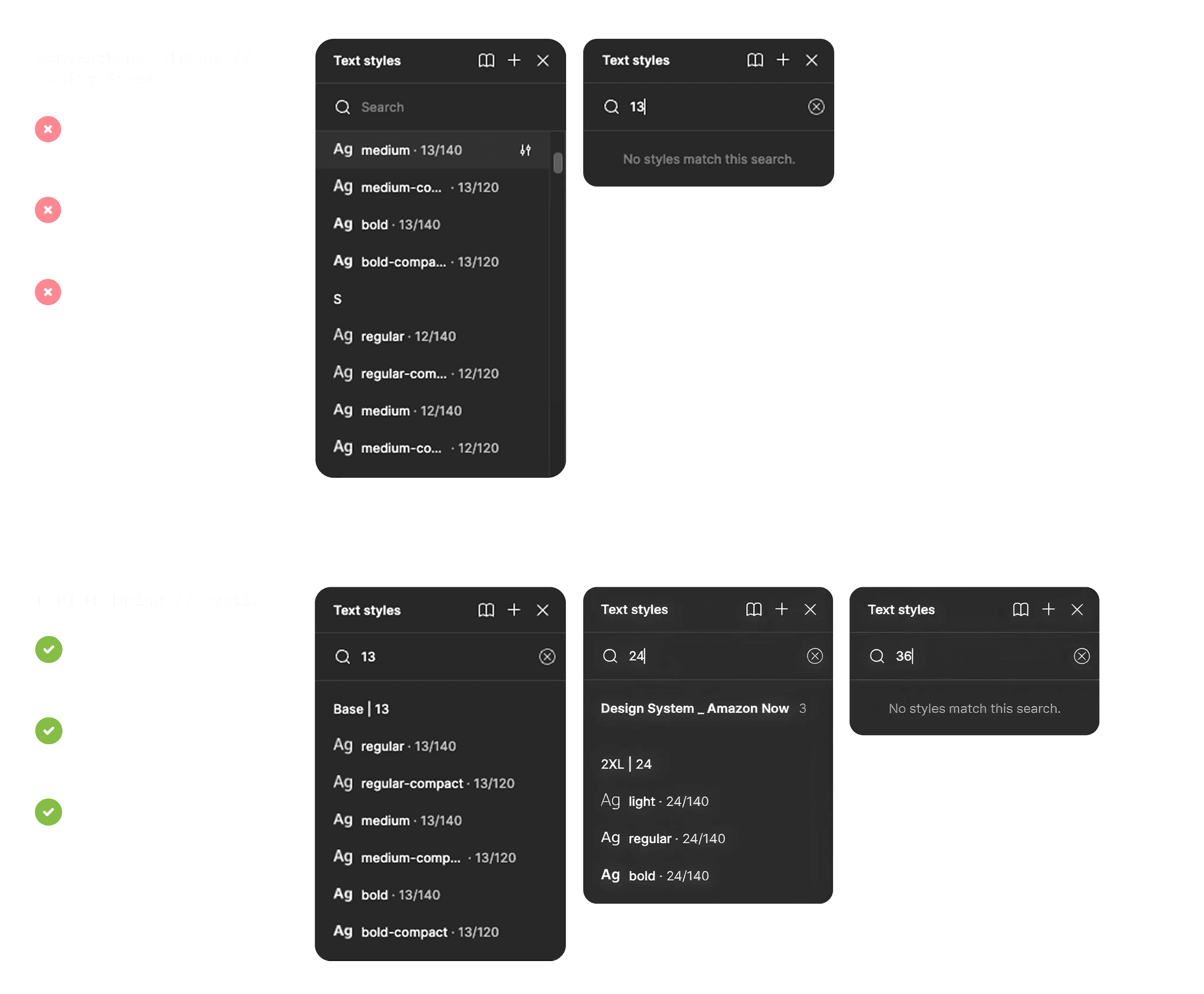
The MVP had no consistent type system. We started by building a clean scale from the audit findings — originally using our own naming convention where the label included the pixel size directly (S12, M13, L16). After reviewing with the dev team, we learned they were familiar with Rio — Amazon's internal retail design system. We adopted Rio's naming convention to ease adoption, while keeping Nimith's own scale values: D1/D2 for display, XL/M+/M for headers, Base+/Base/S for body, Mini/Micro for labels.
PHASE 4
Stress Testing
TESTING the NIMITH colour PALEtte
The design team experimented with colour and type in a playground file.
To help the new colour system move from documentation into practice, Aayush and I hosted a hands-on workshop with the design team. We introduced the base-token structure, explained the intent behind each colour range, and showed how the palette should be applied across everyday product design decisions.
I also walked designers through contrast checks for text and icons at different sizes using the A11y colour contrast checker plugin. After the workshop, the team applied the tokens across icons, backgrounds, text, and CTAs in active design work. Their feedback surfaced edge cases, clarified usage gaps, and helped us make the colour system more dependable in real product contexts.

Testing NIMITH colours across the journey
TEXT Sizing TESTS and SOlutions
Type size accesibility created complex situations.
Entire components had to be redesigned.
The payment component on the checkout page was one such case. Customer feedback had already flagged that users struggled to identify their payment method during failed transactions — simply increasing the text size would only make the component more cramped, so the layout needed a deeper rethink.
Amazon Pay Strings + 10 char.price
Payment method title - 14px
Payment method details - 12px

As expected, increasing the text size improved readability but reduced usability in this case. At the 360px test width, both “Amazon Pay ICICI Credit Card” and “Amazon Pay Balance” were truncated to “Amazon Pay,” making the two payment methods difficult to distinguish.
Amazon Pay Strings + 10 char.price
Payment method title - 14px
Payment method details - 12px

In the longest-string test, using Amazon Pay UPI with a State Bank of India account and a six-character price, overflow became unavoidable. Truncating the account details was not an option, because users still needed to see the last four digits of the card number to identify the payment method confidently.
Amazon Pay Strings + 10 char.price
//Overflow of payment method details
Payment method title - 14px
Payment method details - 12px

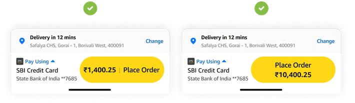
Rather than patching the overflow, the developer, PM, and I agreed the component needed a more fundamental rethink. We redesigned the layout of the payment method details and introduced a CTA variant specifically for prices exceeding nine characters — addressing the root cause rather than working around it.

Longest Payment Detail String
Payment method title - 14px
Payment method details - 12px
5 char.price
Payment method title - 14px
Payment method details - 12px

9 char.price
Payment method title - 14px
Payment method details - 12px

10 char.price
Payment method title - 14px
Payment method details - 12px

PHASE 5
Tokenization
TOKENIZATION
From hex codes to tokens — giving colour a shared language
Tokenization replaced the practice of using raw hex codes directly in designs and code. Instead of referencing a colour like #FFD814, both designers and developers reference a named token — such as cta.background.primary — that maps to that value. This meant that any colour change only needed to happen in one place, and every component that used that token updates automatically.
For designers, tokens brought consistency and confidence. Rather than second-guessing which shade of yellow to use on a CTA, the token made the decision explicit and reusable. For developers, it eliminated magic numbers scattered across a codebase, replacing them with semantic, maintainable references that aligned directly with what they saw in the design file. The shared vocabulary reduced friction at every handoff.

Tokens couldn’t be applied uniformly across all component types. A key distinction emerged between text and icons when handling different emphasis levels. For text, a single semi-transparent token — white at 50% opacity — worked well across emphasis states. For icons, the same approach caused overlapping strokes on the icon paths. To solve this, we kept the icon colour as solid white and instead applied a separate opacity token to the entire icon layer, cleanly controlling emphasis without introducing visual artefacts.

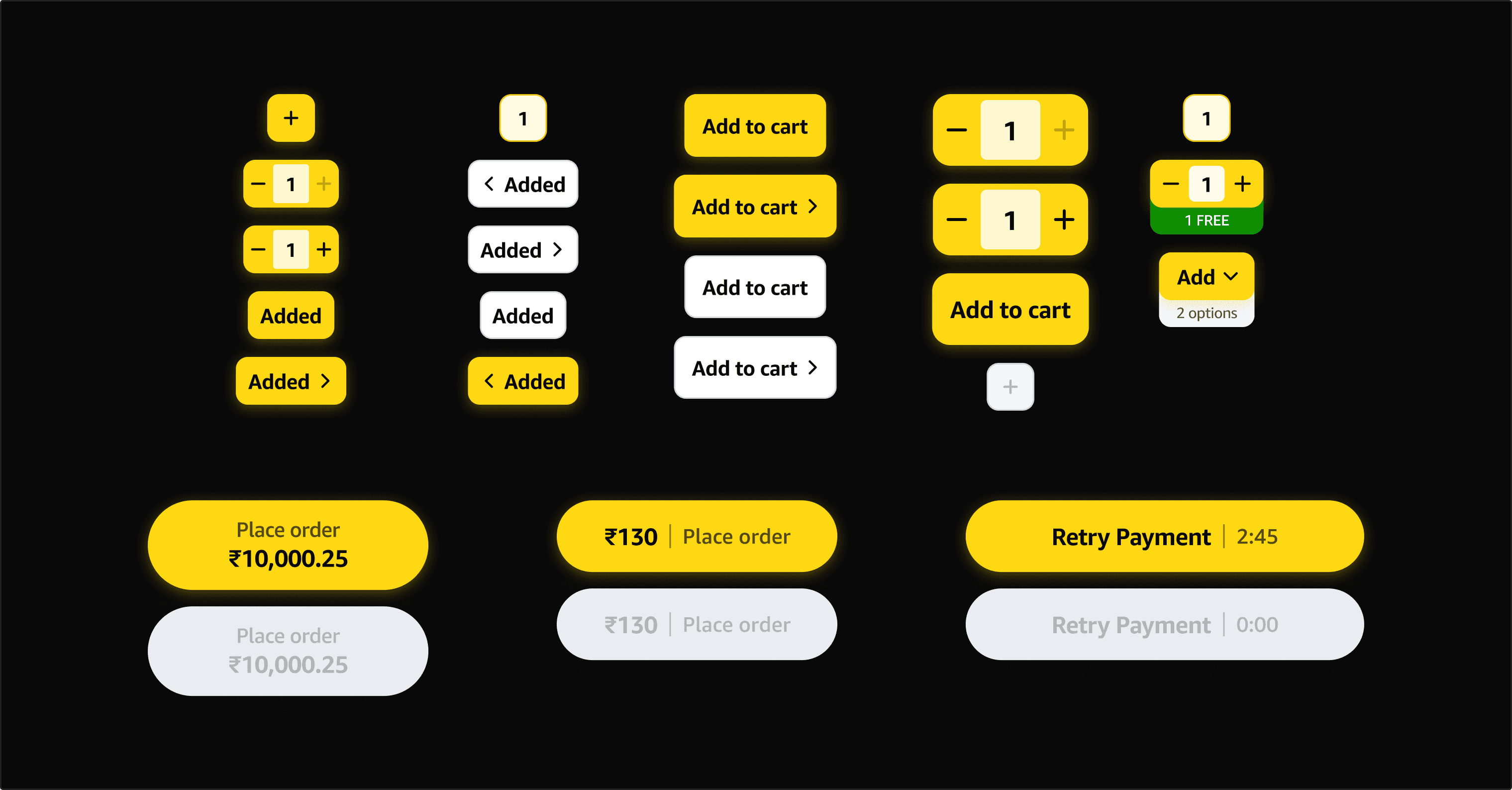
Semantic tokens were defined across text, icons, background fills, borders, and shadows. With that foundation in place, the next step was to identify the most frequently used components — CTAs, input fields, and similar patterns — and extend the token system down to the component level, giving each element its own set of purposeful, named references.

PHASE 6
Resuable Components
TOKENIZATION
Building a design system would also help us to overcome
operational hurdles that appear during the 1-10 stage of growth.
The MLP stage had been fast-paced and focused on the core experience. However, it was now time to address some of the concerns we had regarding setting up some scaffolding for the design process. There were areas where we could get better as a team, make decisions together, and the design system would be a chronicle of those alignment decision made.




PHASE 7
Moving Forward, Looking Back
MArketing + Design + Dev
Include the marketing team from the very beginning.
In hindsight, one of the clearest gaps was not looping in the marketing team until much later in the process. Their needs, such as campaign assets, promotional components, landing page patterns, etc. ended up feeling like additions rather than a natural part of the system. If I were to do this again, I would bring them in from the start, ensuring the design system was built to serve both product and marketing from day one rather than being retrofitted afterwards.
Faster AUditing
Use AI to speed up the process of design system auditing
Auditing the design system — checking for inconsistencies, unused tokens, outdated components, and coverage gaps — was a time-consuming process done largely by hand. Looking back, this is an area where AI tooling could have made a meaningful difference. Next time, I would use AI-assisted auditing to scan component libraries, flag token mismatches, and surface inconsistencies far faster than a manual review allows, freeing up the team to focus on design decisions rather than detective work.
AI-AIDED SYSTEM UPDATES
Push token updates myself using AI agents and relevant tools.
Next time, I’d use Zeroheight to bridge the gap between design and development. It allows designers to contribute directly to the design system’s documentation and token updates, reducing the back-and-forth with developers whenever a change is made. Having a single source of truth that both sides can read from and write to would make design and dev syncing significantly faster and less error-prone.